PAGE 95a – March 2010
H O T I D E A S F O R S M A L L R A I L R O A D S
This time out we’re trying something different. With a general theme of adding extra “excitement” to minimum-space layouts, we have full-length essays by two well-known modellers. Carl Arendt, webmaster of this site, addresses theatrical “tricks” that can bring extra life to any layout; and Prof Klyzlr, whose award-winning layout, Brooklyn: 3 AM, is a mini masterpiece, shares his experience with layout “presentation” to help your line look and work its best. A nice entr’acte by FREMO modeler Bart Bakker shows a way to increase children’s enjoyment of our adult-height layouts. We hope you’ll find a useful idea or two here that can do something special on your layout!
In This Issue
How Stage ‘Tricks’ Can Add Enjoyment, by Carl Arendt
Tall Layout Access for Kids: ‘Up periscope!’ by Bart Bakker
Layout Presentation Boosts the Fun, by Prof Klyzlr
HOW STAGE ‘TRICKS’ CAN ADD ENJOYMENT TO SMALL LAYOUTS
By Carl Arendt, Webmaster
Olympia, Washington USA
This illustrated essay is a follow-up to my article, “Theatrical Layout Design,” originally published in Layout Design Journal magazine and now available elsewhere on this site. That article describes some basic stage techniques, like picture frame stages using wings and flies, along with a couple off-the-wall ideas for model railroad use. This essay carries on from there to describe even more theatrical ideas that can add enjoyment to virtually any layout of any size. A number of these concepts have not yet been tried, to the best of my knowledge. If you attempt one, please let us know about it, so we can all learn from your experience!
The following paragraphs describe a collection of “stagy bits” that I’ve been saving up for several years now, looking for ways to apply them to model railroads. I’m stuffing them all into one article in the hope that you will find among them a new technique for making your layout more enjoyable and effective! Think of this as a basic Idea Grab Bag, and have fun rummaging around. We’ll start with the most familiar theatrical device of all…
A Proscenium Arch (Picture Frame)
Paradoxically, the familiar picture frame or proscenium arch approach is used increasingly these days on large, around-the-wall layouts. They’re often erroneously called “shadow box layouts” (see my previous article for a diatribe about this point). Strangely, fewer small layouts tend to use picture frames, even though it can help convert a mundane layout into a winner!
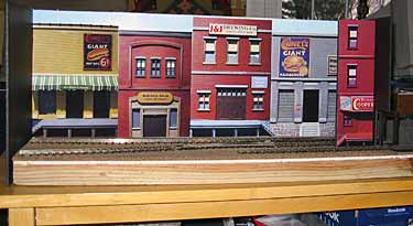
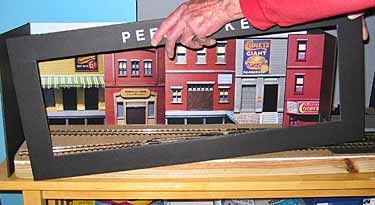
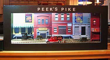
The example in these pictures shows why. It’s my Peek’s Pike layout, a simple On30 switching line 1 meter long. The top left photo shows it with tracks and scenery roughed in. At the upper right, I’m putting the black foamcore frame in place; and at left, the picture frame is established. This is a sequence I have actually performed in front of audiences—assembling the scenery onto the baseboard, then attaching the picture frame and turning on a light. There are usually audible gasps of surprise from the audience at this point. I’m not sure the difference shows well in the photos, but a picture frame will improve almost any layout’s looks. Try it, and you’ll see.
Picture frames, of course, have many uses beyond making the layout look great. For example, they control the audience’s lines of sight, making it easy to take trains on and off the visible layout smoothly. They provide a valence to hold the layout’s name and to make lighting the scene easier and more natural (discussed below, under that heading). They also make it simpler to use many of the special effects considered in the next section.
Set Design
In the theater, what the audience sees behind the proscenium arch is the stage set… the scenery that provides an environment for the play. Likewise, our layouts use scenery to provide realistic and mood-setting surroundings for the trains. Several theatrical devices that enhance scenic effectiveness might be applied to our layouts.
One device familiar to railroaders is the turntable. Stage turntables are larger than you might think—New York City’s Metropolitan Opera has a 57-foot-diameter table (over 17 meters) mounted on a wheeled wagon so it can be hauled onstage and off! The idea is to build two, three or even four separate sets on the table, then change scenes by simply rotating another section of the table into the audience’s view (usually while the lights are out or the curtain is closed).
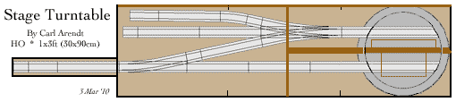
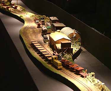
The simple example shown here is a very small (36x10in or 90x25cm) two-set layout. It’s an industrial switching line, that hauls material (coal, ore, clay, etc.) from the source to the processing plant. The table is an Atlas decked model, with two symmetrical tracks glued on the deck and a central backdrop with scenery on both sides. The turntable represents both ends of the line. As drawn, the loading tippler at the mine is visible on the turntable. The power plant where the coal is consumed hides on the other side of the table. A Trackmobile is used for power, and it pulls a loaded hopper from the turntable over to the fiddle track.
At this point the lights go out in the right-hand area of the layout. While the TM pushes slowly through the switch toward the rear track, the now-invisible turntable turns 180 degrees so the power plant side of the scene now faces the audience. If desired the TM can do a little switching in the holding yard on the left-hand side, then it moves back to the fiddle track and—as the lights on the right come back on—pushes the loaded car over to the power plant. Journey finished, load delivered! Repeat to taste, or make an unloader and do it in reverse to return empties to the mine.
I’m sure the agile minds of our readers can imagine some more-sophisticated ways to use stage turntables in layout designs. I’d love to hear from you. (Note: there’s a similar, and even simpler, turntable layout in Scrapbook #52a.)
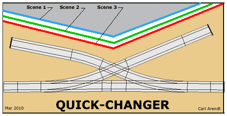
Another set design stunt is using nested sets, where two or three (or more) sets can be packed closely together with only the front one visible. To change sets, then, you just peel off the front set, to reveal the one behind it! The HO Quick Changer layout (right) stacks three sets together in a 2x1ft (60x30cm) space. To run trains, track cassettes will be needed on either side, or you could add 180-degree curves to each end and complete an oval backstage.
A little peddler freight enters, switches the locale (which is shown as Scene 3) and departs. Lights down. Lift away Scene 3. Lights up. Peddler returns to switch Scene 2. etc. You can have as many destinations as you can pack together! And as much rolling stock (stashed offstage) as you wish! This concept allows you, in two square feet, to have three (or more) switching centers represented and visited by your way freight hauling an amazing variety of freight cars. Needless to say, the “sets” are entirely low relief, with no protruding entanglements.
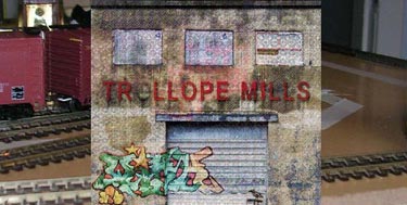
Yet another stage device that might be useful to modelers is the scrim. It’s made by hanging a vertical curtain made of loose-woven material, and painting a scene on it. When lit brightly from the front with the area behind left in the dark, the painted scene shows up well (above left). When the front lights are turned off and the stage behind the scrim is brightly lit instead, the curtain becomes virtually invisible and the scene behind the scrim takes precedence (above right photo).
I’ve never seen this effect used on a model railroad, but it could be a powerful way to focus attention alternately in front of, and behind, a vertical scene. One possibility might be to show activity both outside and inside an industrial works. The above mockup was done with Photoshop, using a scene from one of Jack Trollope’s many under-construction layouts.

One famous theatrical use of a scrim is in Stephen Sondheim’s musical, “Sunday in the Park With George.” The show includes a full-stage-sized scrim showing Georges Seurat’s famous painting, A Sunday Afternoon on the Island of La Grande Jatte (left). Then, magically, the light shifts to the back, where actors are posed silently in the same positions as in the painting… then they suddenly begin to walk about, and the show begins!
Another off-the-wall theatrical set design idea—already creeping into model railroad use—is the limbo set. Here the major scenic elements are brightly lit, and all the rest of the stage is in blackness. The technique emphasizes the single setting like a jewel. An outstanding example of a limbo set applied to layouts is Totternhoe Mineral, by Eamon Seddon. The photo at right gives the idea… the color is confined to the railroad right-of-way; the rest is black. The effect is striking! For more pictures, see Scrapbook #55a.
To see this idea in use on a small layout, check out Gavin Sowry’s black edging and corners on Haywards Estate Railway in #73a. He paints his layouts black around the edges because “it emphasizes the layout colors more strongly,” and he credits Totternhoe for the idea.
Another important set design aspect illustrated by this photo is the importance of lighting. Totternhoe uses straight down lighting focused on the narrow strip of railroad land. But notice that in some places the spotlights are particularly strong to emphasize individual areas of interest. Overall, the effect is one of sunlight-and-shade, like a landscape on a sunny day with clouds drifting by, casting random shadows. And amazingly, our eye accepts this very unequal lighting as a quite natural phenomenon, very realistically modeled! These considerations bring us to a vital part of theatrical model railroading.
Lighting
Lighting is perhaps the most important single aspect of both theatrical sets and model railroad scenery. Fortunately, considerable experimentation over the past few decades around the world has resulted in a general consensus about the best approach. Here it is, as summarized in Scrapbook #60.
For general lighting, the best bet is daylight fluorescent lamps mounted above the layout to cast a general clear, sharp illumination. Halogen spotlights then can be used to infuse sunlit warmth into the scene and to emphasize particular areas of interest. The photo at left of Gilbert and Michel Gribi’s layout, La Vernarède, shows this approach in action. The main lighting comes from fluorescent tubes in the ceiling, covered with a sheet of translucent plastic to act as a diffuser (eliminating hot spots). Halogen spotlights are mounted on outriggers, slanting the light to emulate warm sunshine and highlighting noteworthy areas of the scenery. For much more on this issue, including construction details and color rendering examples, see #60.
There’s also considerable practical advice about lighting in Scrapbook #58, along with a beginning look at night-lighting. For a master class in after dark illumination, see Prof Klyzlr’s Brooklyn: 3 AM in Scrapbook #87.
Appeal to All the Senses
To be truly theatrical, we should really attempt to appeal to all the senses of our viewers. We’ve been concentrating on sight, but there’s also hearing, smell, taste, and touch to consider. I think we can rule out touch, because we probably don’t want the audience to finger our models nor our scenery! And taste is easy… there are an increasing number of materials-handling model lines that truck small candies from the mine right down to ground level and dump them into the hands of eager audience members (children of all ages). But let’s spend a moment on the other two senses.
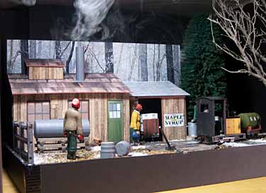
Aromarama—The sense of smell is possibly the least used effect in model railroading. Yet, it can be a super layout enhancer! A classic example is my SAP Line (right), a model of a Pennsylvania sugar house where maple sap is boiled down into syrup and sugar treats. These establishments are always wreathed in steam from the boiling process… and it’s easy to model the effect using simple electrical smoke machines like the ones in Lionel and Hornby locomotive smokestacks (chimneys). In this case, I used maple-sugar scented smoke fluid from Mega-Steam. When turned on, the smoke rapidly filled the room with the mouth-watering aroma of maple syrup! The layout became an instant—and memorable—hit. I called it the Arendt Aromarama. There are many other aromas available to create moods that might fit your layout. Makes a lot of scents!
Sounds Around and Sounds of Trains—There are two complementary approaches to incorporating sound effects into a layout. One is environmental sounds (also called “ambient sounds”), which are the noises that surround you all the time… from distant crickets and birds’ cries in a rural scene to sirens, church bells, and honking taxis in the big city. They’re complex sounds and very effective in helping a scene come to life. We’ve covered this subject in several past Scrapbooks—give a listen to the switching yard background sounds in #57a (under the heading Sounds Around), and to the carefully crafted soundtrack that accompanies Brooklyn: 3 AM at #87 (bottom of the page). These “theatrical” effects are well worth exploring to enhance any layout.
The second type of sound is more familiar, it’s train noises, the sounds made by trains running. There are a number of good systems for reproducing these sounds and synching them with your trains, either from on-board or from under-the-baseboard. The point of including them here is that these sounds add immensely to the effectiveness of a micro or small layout. If you haven’t yet tried them out, you might want to do so. To demonstrate the point, we have a newly-updated version of Ken Olsen’s switching operations on his layout, Dawson Station, which was voted among this site’s top favorite layouts of 2009.
Ken’s N-scale 1x4ft (30x120cm) micro layout faithfully models the Hull-Oakes Sawmill in Oregon, which was one of the last railroad-served steam sawmills in the U.S. Ken has reproduced a typical switch-run to this mill and made a video on his tiny layout to show how it worked. I’d suggest you start by turning off the sound on your computer, and watch a couple minutes of this excellent tape. Then stop, rewind, turn the sound on, and watch it all the way through. YOU’LL BE AMAZED AT THE DIFFERENCE TRAIN SOUND MAKES. Even on very small layouts!
‘UP PERISCOPE’ GENERATES TALL LAYOUT EXCITEMENT FOR KIDS
By Bart Bakker, FREMO-USA
Utrecht, Netherlands
Members of FREMO, the European modular layout group, are noted for innovative modeling and big collaborative layouts. Bart Bakker, an active Dutch modeler, is a long-time member of FREMO. Bart’s personal layout, Saguaro Junction, includes several integral FREMO modules and is featured in Model Railroad Planning 2010 (U.S.). Bart shared with me an innovation of his own, along with some observations about recent public exhibition activities, and agreed that I could pass them along to you. —Carl
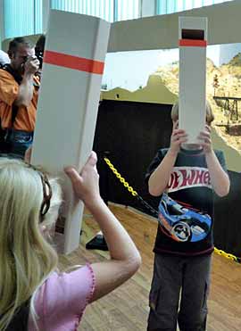
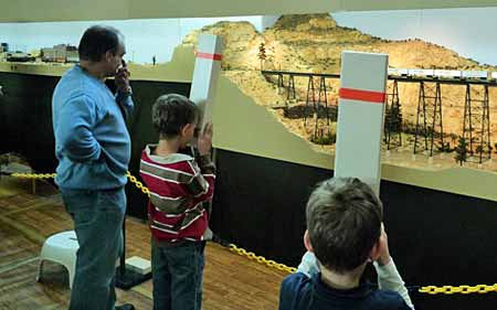
The dreaded issue of layout height might be an existential subject for exhibition layouts, but it is a real problem for kids (and people in wheelchairs)… so we [a group of Dutch FREMO-USA modelers] solved it for them! For the US-Modellbahn Convention in Rodgau last autumn, I made a handful of 50cm-long (20in-long) periscopes out of plastic tubing and a couple of mirrors. We call it (what else?) the FREMOSCOPE. Kids like them, and fathers and grandfathers do too, because they do not have to lift the kids up. We found we had no need to keep track of the periscopes, they always reappeared miraculously.
The bridge in the back is our Gila River Canyon, a FREMO module. Our skirting is straight with no folds. An earlier version with folds proved very distracting and was abandoned. We spent a lot of time selecting the skirting (it is dark green) and the color of the barrier chain, to attract attention to the layout as Prof Klyzlr recommends in his article (below).
As Prof also mentions, we too find tremendous interest in the backstage activity. Next time we will give viewers full view of the staging yard operations, which they consider to be a part of the action in addition to the theatre up front. (We will even apply skirting on the staging yard, to hide the mess!)
PRESENTATION BOOSTS THE FUN FOR BOTH OPERATORS AND VIEWERS
The Practical Side of Making Your Layout ‘Show-Worthy’
By Prof Klyzlr
Sydney, Australia
Just like the cuisine in a good restaurant, “presentation” is the key to getting enthusiastic audience response from a layout and the best efforts from its operators. Prof Klyzlr, the pseudonym of an active modeler on the Australian scene, here shares his experiences with preparing a variety of layouts for exhibition and display. Prof’s own layout, Brooklyn: 3 AM, was selected by readers of this site as their favorite layout of 2009. You can read about it, and see some of Prof’s presentation principles in action, in Scrapbook #87. —Carl
“Presentation” is critical to how a layout is perceived. Indeed, the owners/builders of the first show layout that I was ever involved with, Mark and Angela Fry who created an HO multi-gauge Aussie logger called Swan’s Crossing, emphasised “presentation” of layout, “backstage,” and even the layout operators themselves, as a complete package.
So… When you have your layout built, superdetailed, tested, and ready to roll… what else might you consider about showing it to “the public,” either at home or at organised train shows? Let’s look at some of the humble but important presentation elements that are too often neglected by modellers.
Skirting
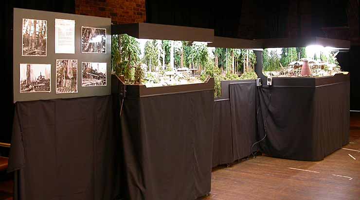
Skirting is very important to conceal the bottom and legs of the layout, both to “hide the warts and wiring” and to keep the viewer’s attention topside where it belongs. Skirting is often done very badly (or worse, ignored entirely), which is a shame because the difference between “badly” and “well done” may be simply a matter of attention to detail. Of the five layouts I have built or been involved with, all have used black flat bedsheets as a source of lightweight, easily sewed and customised skirting.
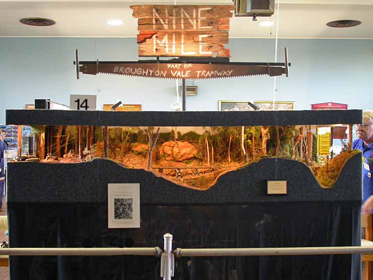
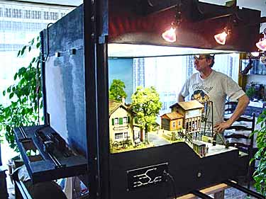
The image above is of my last On30 logger, Nine Mile. The skirting is “flat line” skirting (significantly easier to make than “pleated” skirting) using modified Esprit sheets. These skirts were made to 1200mm long [about four feet], which nicely matches my preferred module length. The seams between skirts are velcro’d, so they naturally sit flat against each other when viewed front-on but easily split for access to switches and such by right-handed people. (Yes, like men’s and women’s shirts, the direction of the seam overlap will “prefer” either right- or left-handers).
The skirts are velcro’d atop the modules, with the skirts using the hook. The “catch” (pun intended) is that the modules are faced with charcoal car carpet, which effectively works as the velcro “loop” half. This single-handedly avoids most of the aesthetic issues with velcro-attached skirts, and makes setup and teardown of the layout a breeze. (Swan’s Crossing used this technique back in 1995, it has since gone on to become very popular all over the Eastern Aussie show circuit.)
Another major concern for exhibitors, especially when contemplating the use of lightweight skirts, is the “Marilyn Monroe” effect when the layout is placed in a particularly jetstream-prone position in the hall (someone opens a set of double doors, and suddenly your layout’s in a wind tunnel). The solution is:
You can pick up a packet of fishing lead sinkers and have your Layout Skirt Seamstress sew them into the bottom edge in an “oversized hem.” The skirts will hang flat and straight everytime, even under extreme weather and draft conditions.
Signage
It’s amazing how often people forget about making signs, or put them in inconspicuous places where no one notices them! Signage should always be visible and appropriate—and a touch of creativity wouldn’t hurt.
Again, check the image above. The Nine Mile sign is a pair of vertical aluminium L channels, to which are bolted some Aussie ironbark planks. (These were donated by one of the layout operators from the pile of materials leftover after the demolition of his back fence.)
Below that is a 5-foot crosscut saw I spotted in an antiques store located in the town where the layout’s prototype “logging operation” was based.
Both parts are anchored with ½inD bolts and nuts to a length of 25mm aluminium tube, which is clamped in a 32mm galvanised post junction and mounted on top of a seriously over-engineered floor tripod stand. [All visible metalwork is rated at over twice load-rating, so there are no issues about having a heavy metal sign hoisted over people’s heads. In today’s litigious environment, all live-event production crews consider load ratings and stability of structures in the hall very critically!]
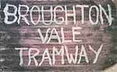
For another example, check the image at left. it’s hard to see, but this is a strategically cut sheet of corrugated iron, treated with Muriatic Acid to produce a rusty appearance (sort of 1:1 scale weathering!). This was the sign for my first show layout, Broughton Vale Tramway.
As a final example of signage, below right is the sign for my current HO street switching layout, based on the corner of 41st St and 2nd Ave in Brooklyn New York USA. [See Scrapbook #87 for more about Brooklyn: 3 AM.]
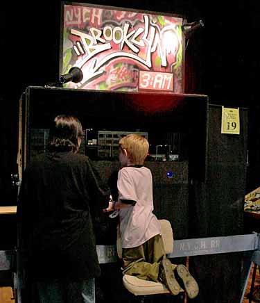
The sign itself is a sheet of 5mm foamcore. It is mounted in an aluminium tube frame, making a sign 600x900mm in overall size. At the bottom right is a scratchbuilt LED matrix display which can easily be seen from across the average basketball-court-sized show hall. The design is derived from a graphic on a T-Shirt I own. It was scaled, stenciled, and sprayed over with a selection of cheap spray paints from the local hardware store. Given the layout’s “down and dirty New York City” nature, I think it suits the layout nicely!
Now, the practical issues.
Sure, you could take the sign project to a sign painter, perspex pro, or neon sign guru. (I was contemplating using one of the signs from the Brooklyn Brewery as the sign for the Brooklyn: 3AM layout, until I worked out how fragile such a sign would be!) However, all of the sign examples I’ve shown are totally do-able by any modeller with the skills to build a layout and a “regular toolkit” set of tools. This saves time, money, and most importantly, puts the “creative control” in the hands of the modeller… you.
Backstage
This is a funny one. If you follow the Iain Rice or Carl Arendt “theatrical” school of layout design, then the idea is not new to you that “backstage/offstage/staging yards/show crew relief space” area really should be screened off from public view. However, you will be amazed at the number of punters [viewers] who try all manner of acrobatics to see what happens behind the curtain. (Shades of the Wizard of Oz: “…Pay no attention to that man behind the curtain!…”).
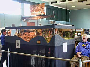
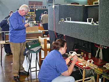
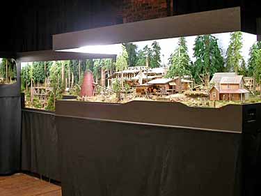
Here (above left) is a view of Nine Mile from the front right-hand corner. Notice that the “backstage” area is not visible. The behind-the-scenes view (above right) shows one of the operators working on a figure, another getting some equipment ready for its turn on the layout, and the mandatory “show card-table” with a spare cassette staging system ready to be loaded. (Another cassette is visible up on the layout.)
You will also hopefully have noted that all of the layout operators are wearing matching blue Nine Mile embroidered shirts. These are nowhere near as expensive as one might expect. They’re maybe not so critical for one-man shows, but if you have a regular team of operators it’s a worthy investment in the layout’s overall presentation.
One other important use of the backstage area may be worth thinking about. Swan’s Crossing‘s backstage area was deliberately painted lilac blue (in contrast to the charcoal carpet fascia out front), as it was regarded as a soothing, calming colour. Because the backstage area was considered a “crew rest” from the stresses of fronting a layout and dealing with The Public, anything that helped keep the operators calm, composed and ready to “give their best” for the crowd was a Good Thing!
Now, not everyone will want to build a layout that uses proscenium (picture-frame) modules with integrated roof/lighting rig. However, tag-team this module design with a near-eye-level display height, and the backstage almost hides itself. So what about other situations?
Here’s an example, courtesy of John Garaty, from Unanderra, Australia. This layout is a promo for a local 2ft (600mm) gauge museum. The track height is barely 900mm (3ft) above the floor, so even young kids can get an eye-level view. The top of the layout is a shelf for display of other models and promotion materials for the Museum. Ergo, kids get the “look at the trains!” wow-factor, and the parents get the “pitch.”
This layout also has carpeted modules, velcro-attached weighted skirts, and a sign mocked up very quickly to look like a New South Wales Government Railway station sign. (It’s two thicknesses of foamcore, a handful of 3mm particle-board letters from the crafts area of the local hardware store, and regular modelling paints.)
Here are a couple other examples spotted at the 2007 Australian Narrow Gauge Convention in Melbourne.
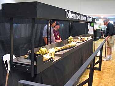
Totternhoe Mineral, by Eamon Seddon (above left) takes a particularly interesting approach. The layout modules are actually displayed fairly low to the ground. They are in trestles, and faced with flat black layout skirting. However, instead of hiding any backstage operator antics, the operators stand behind the layout modules but in front of a full-height black theatrical drape that wraps around and encloses the sides of the layout stand area. The operators can readily converse with the viewers, and low, black backscreens plus downlights with spotlighting help keep the viewers’ attention on the trains.
An alternative approach is to have the operators located in front of the layout with the punters. This is my personally preferred method because it affords better “punter interaction” and a much more engaging experience all round.
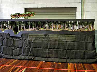
Returning to higher level layouts (chest-high or even eye-level) is Tom’s Creek, an On30 logging layout by Allan Ogden (above right). Note the smaller sign and the demonstrated importance of taking care when ironing and folding your layout skirts!
As a final example (above and right), I offer Geoff Nott’s Leigh Creek On3 layout, as shown at a Fine Arts Show in Sydney. The layout skirts here are again built from black flat sheets, velcro’d onto the modules. In this case, the modules are painted black, so the “edge” of the velcro is hidden by a small-cross-section pine beading. This also acts as a nice “guideline” when installing the skirting at high speed.
From time to time various people have suggested that the craftsmanship shown on many layouts is well within the realms of Art. [Carl Arendt suggested this in Scrapbook #76.] Seeing many examples provided by the railroad modelling community, I completely agree. I have seen this particular layout easily “stand up, stand proud, and stand tall” amongst oil paintings, sculptures,and other examples of traditional Fine Art. Its presentation is a big help in creating that impression.
Overall, these are some practical, tested approaches to presenting your layout in a way that increases enjoyment of it not only by the viewers, but by the owners, builders and operators.
Leave a Reply